Accelerating E-Commerce Activation
Revolus offers a cloud-based e-commerce solution that empowers businesses to create, launch, and oversee personalized online stores with ease. With Revolus, businesses can design their e-commerce websites using custom domains and personalized themes. The platform provides a convenient built-in content editor, enabling organizations to effortlessly add or modify text content and images throughout their website.
-
Project Type
Client Work
-
Role
UI/UX designer
-
Year
2022
-
Team
1 Product manager, 2 ux designers, 8 engineers.
The Problem
The sales team at Revolus has historically carried all the burden of selling the product to new trial users. We came to understand that a marker of a successful digital platform was the ability to sell itself via an optimized and streamlined onboarding process. The existing onboarding experience was disjointed with many points of disconnect and distraction leading to new users abandoning their trial stores.
The Solution
Effective onboarding guides users to experience the value of the product the first time they use it. Identify what tasks a user needs to complete to perceive that value. Then, through implementation of onboarding best practices, eliminate points of friction and get the user to reach the “a-ha!” moment as quickly as possible.
My Role
I was responsible for designing all user flows, UI patterns and visual elements needed for this effort. I collaborated with a product manager on research and product strategy. Together with a developer, we implemented a comprehensive in-product onboarding experience.
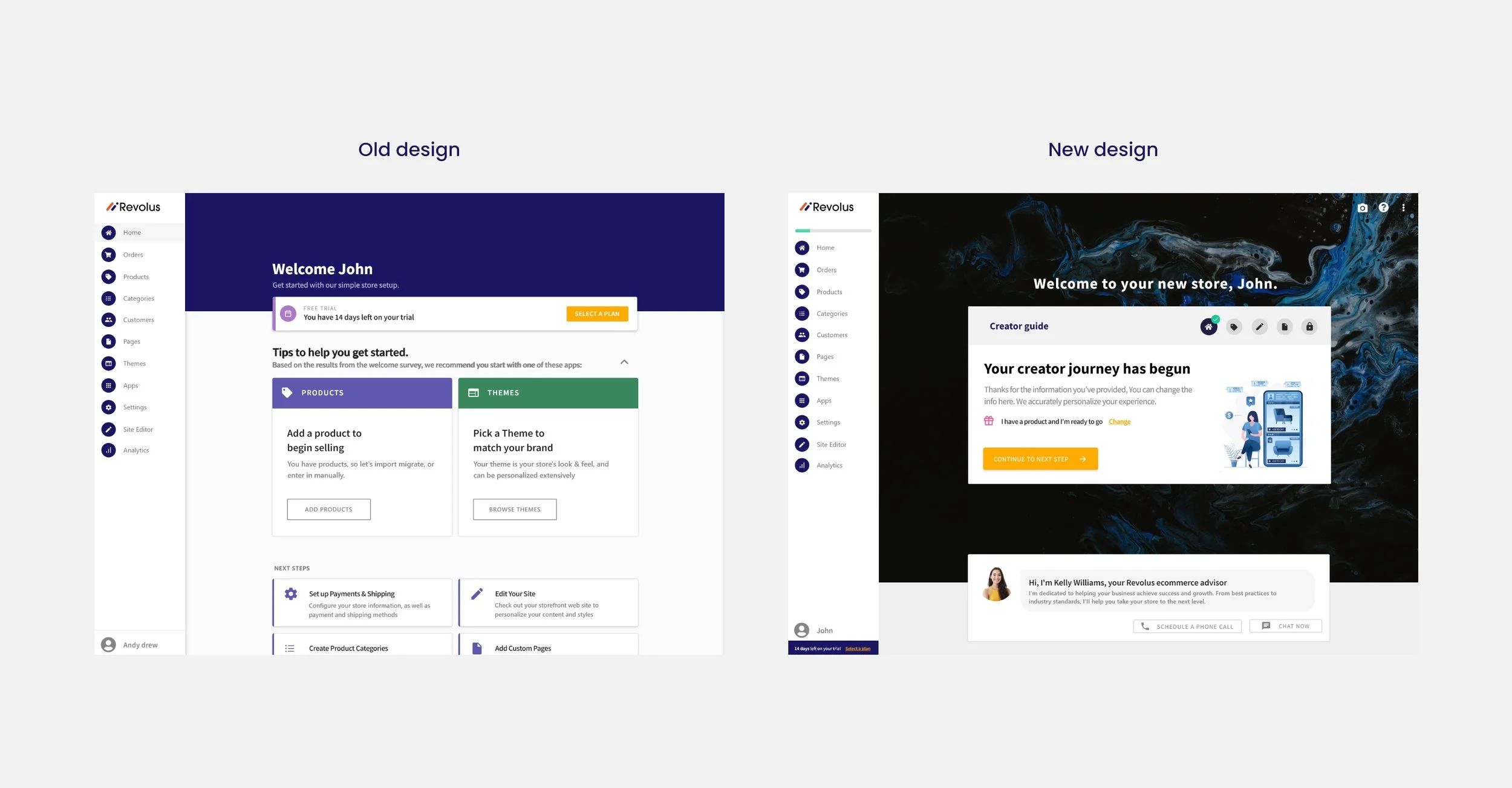
Onboarding
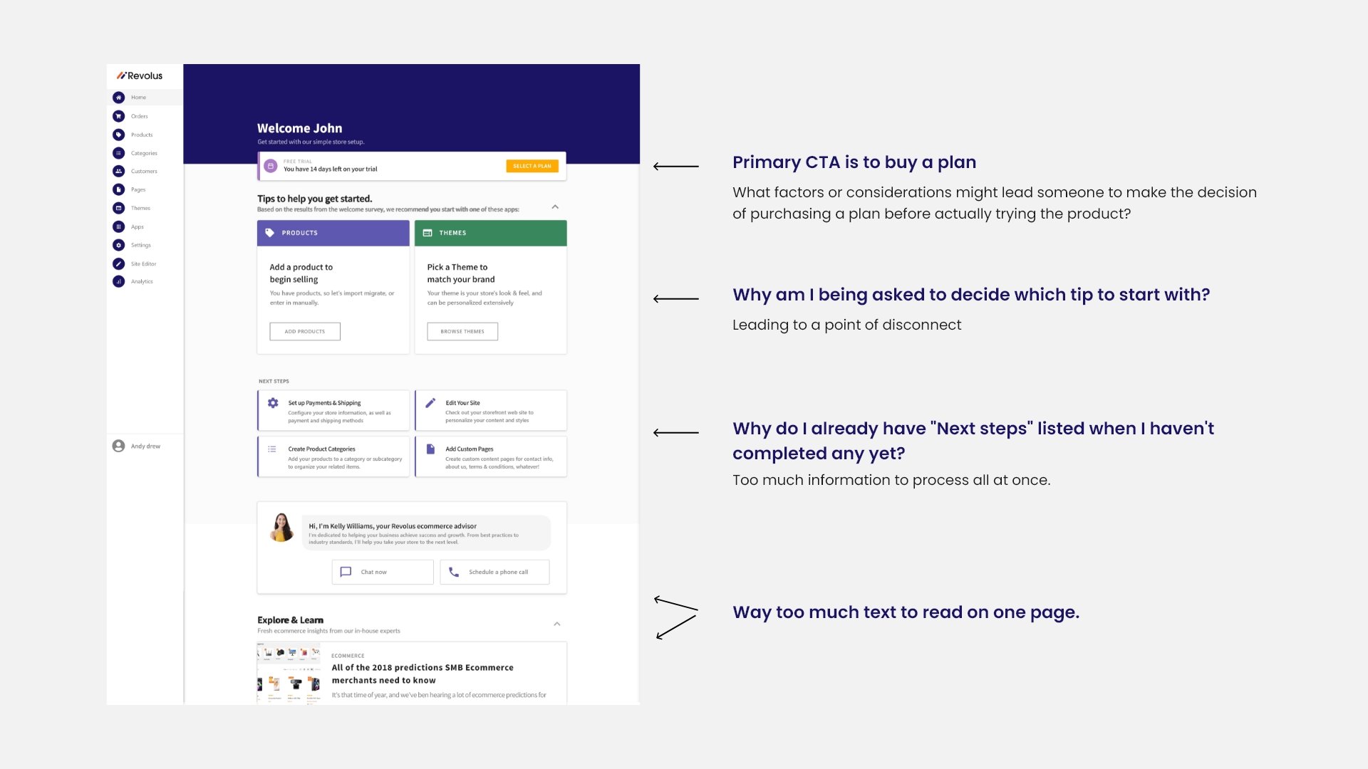
The onboarding project had been running for a few months with a designer whose accomplishments included redesigning the Revolus dashboard and adding recommended "next step" cards meant for merchants to complete and learn more about the platform and its features.
During this time I would occasionally be asked to review designs and provide feedback on aspects of the experience. Later the product teams were shuffled around and I was asked to take over this project.
The idea is to improve the experience were beginning to stall. So as a way to refine the vision, we got in touch with a well known user onboarding consultant. They provided an in-depth teardown of Revolus onboarding process. Needless to say, it uncovered many areas for improvement.
Understanding the problem
The main takeaway from the onboarding teardown was that the existing experience was saturated with points of disconnect and distraction. The newly designed dashboard was overly complex with too many things to look at, and most significantly, no clear guide for new users to quickly start understanding the value of the Revolus software.
What I did ?
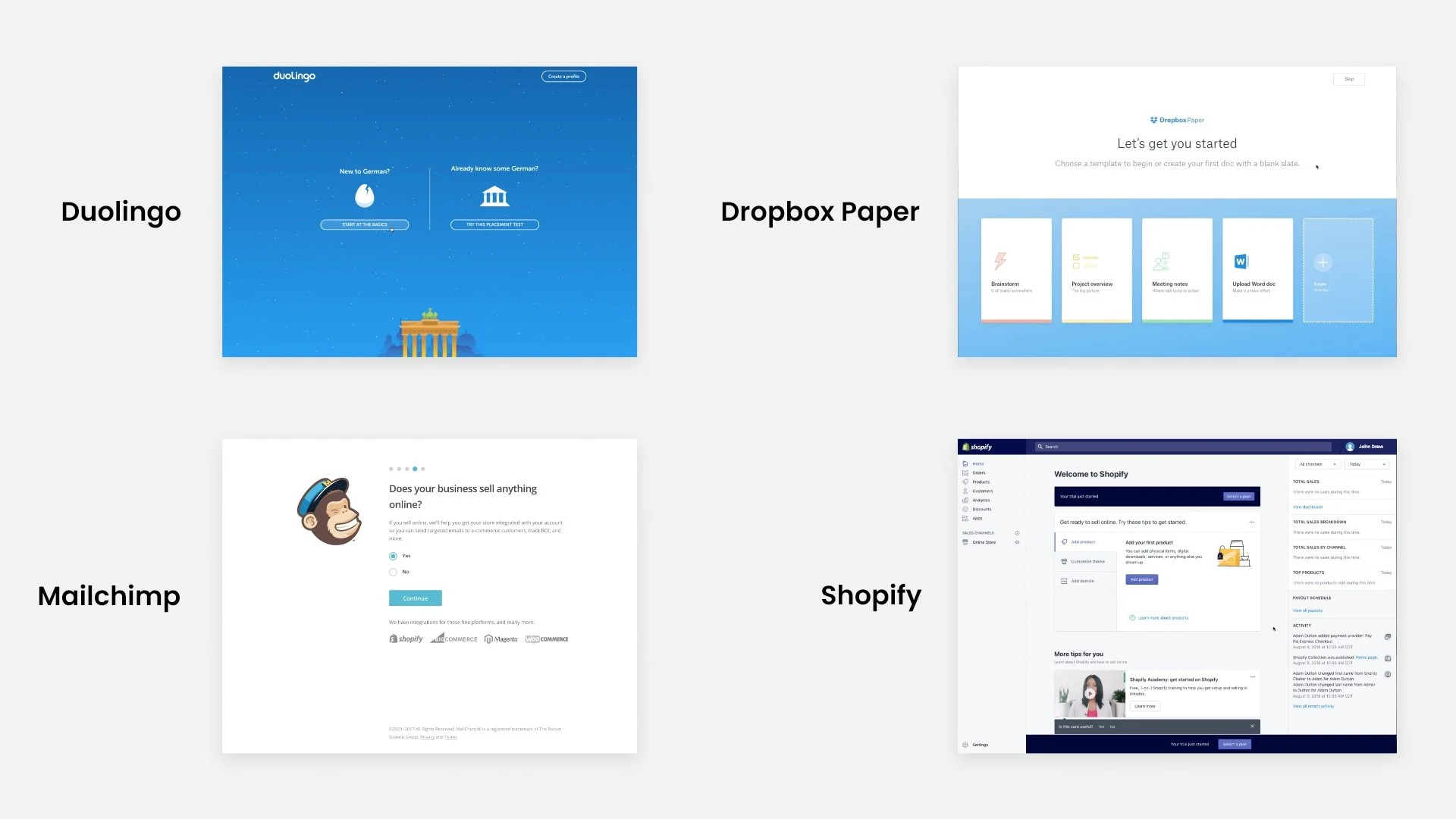
In addition to learnings from the teardown, I conducted competitive analysis of other product onboarding processes. I compared and identified the differentiating factors as well as areas where we believed our new experience would shine brighter.
After distilling our research, we were able to define a new vision:
Get new users to understand the value of the product as fast as possible - According to CRO experts, 40-60% of free trial users never return to see the product a second time. Pick out "quick-wins", things that users can do in the product in order to become highly engaged.
Eliminate points of friction and disconnect - Simplify the UI and eliminate all distractions that could lead the user astray.
Personalize the experience - Users aren't buying the product, they're buying a better version of themselves. Tailor the trial experience to their specific needs.
Ideation and strategy
At this point, we knew that any iteration to the experience would lead to an increase in trial-to-store conversion rates. In order to release improvements as fast as possible, we decided to validate success by A/B testing the new experiences against the existing ones. This would allow us to push changes out in frequent, smaller releases, rather than spend significantly more time prototyping and user testing one larger feature before release.
Next we had to decide the stage(s) of the Revolus onboarding process on which we would like to focus our improvement efforts.
The main stages of a typical Revolus trial user's onboarding experience:
Welcome survey
Free trial
Purchase a plan
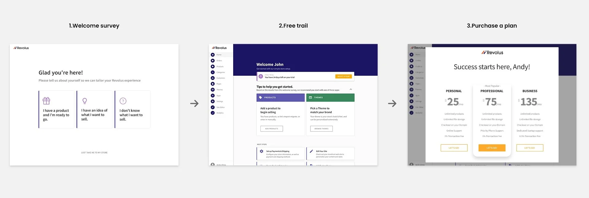
The existing welcome survey was collecting data about users and their needs, but it was never actually used for meaningful personalization of the trial experience. We quickly identified this as a key opportunity.
The free trial was essentially a 14-day all-access pass to Revolus. Just because a new user could wait 14 days to purchase a plan certainly doesn't mean we wanted them to. We wanted a streamlined process a user could finish in one sitting while becoming highly engaged experiencing the core values of the product. To accomplish this, we would have to guide users all the way through the free trial stage, completing high value steps along the way, and then drop them right in front of the button to purchase a plan just as they reach peak engagement.
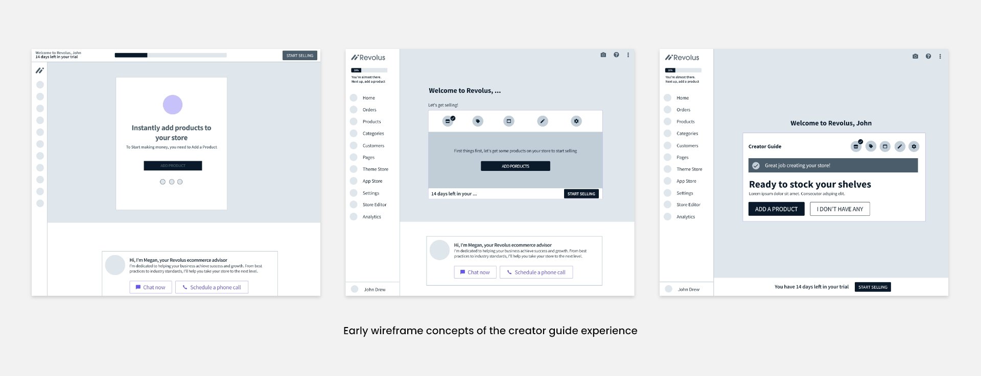
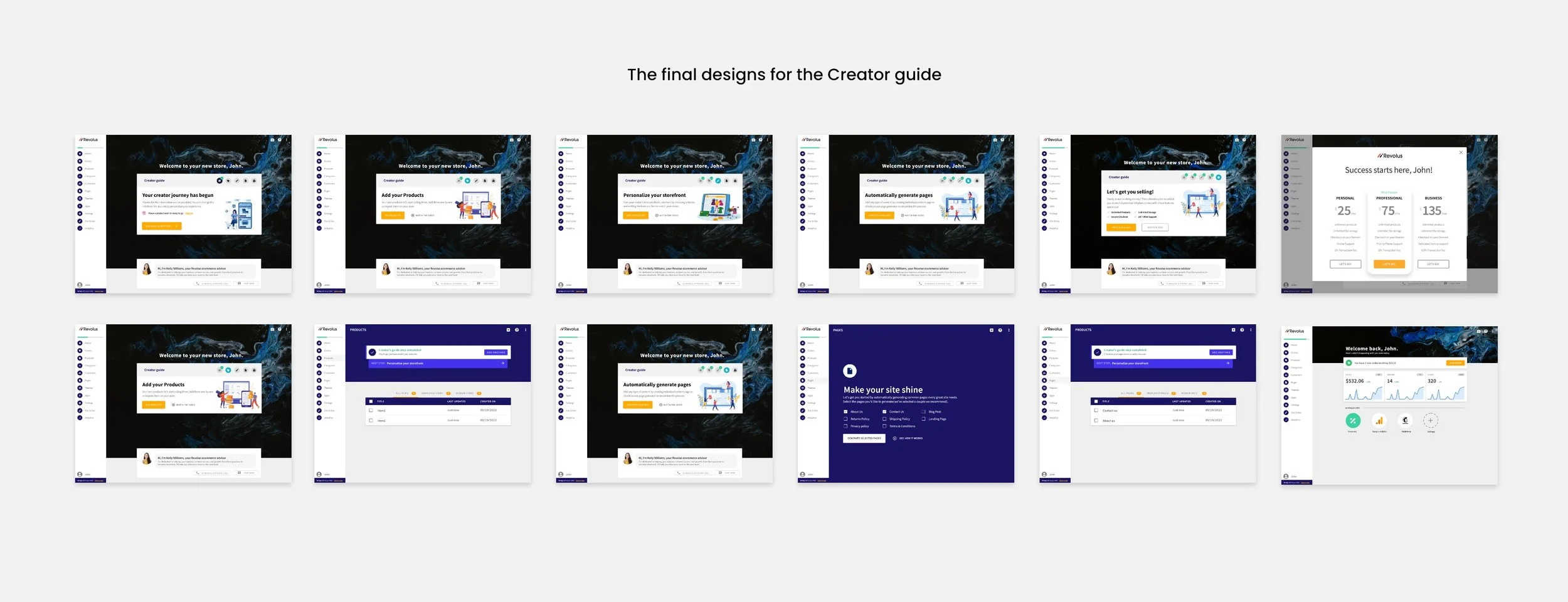
The "Creator Guide"
Revolus lovingly refers to its thousands of users as "Creator", because they've all created their own online businesses. It was only natural to call the experience guiding them to become creators the "Creator Guide".
Because we were committed to adhering to the vision of onboarding improvements, the Creator Guide would need…
To be the focal point of the free trial
To be personalized using the welcome survey data
To be simplified to 3-5 steps
To have persistent progress indicators and step completion notifications
To have each step completable with 3 clicks
The first four requirements were already achievable with visual design treatments and an already existing notification system. The last requirement ended up being quite a fun challenge.
The first step in tackling the 3-click challenge was solidifying what the Creator Guide steps would be. I employed the "endowed progress" effect to add an already completed "Welcome Survey" step as number one. As an ecommerce platform, I know adding a product is an important and engaging first step. Next, since Revolus is also a website building platform, we chose editing the storefront design as another step. That led us to choose one last engaging step: adding a content page.
Let's see if we can complete each step in 3 clicks:
Fill out welcome survey (already completed)
Add a product → Products empty state/landing page → Type product name & price → Save
Edit storefront design → Click "logo" → Drop in logo → Save
Add content page → Pages empty state/landing page → Type???
I knew that adding content pages (e.g. About Us, Contact Us, Privacy Policy, etc.) is an important and engaging step for building any website, but if we wanted to add it to the Creator Guide, changes would have to be made.
The "Page Generator"
The most popular business tools on the Revolus website are the "Privacy Policy" and "Terms & Conditions" generators which give you personalized text you can put in a page on your site. I thought: Why not use that same idea for a bunch of common content pages founders need on the storefronts?
I decided to transform the empty state/landing page to have a few checkboxes (some preselected) and a big "Generate Pages" button, which when clicked would generate the selected pages and include any known personal details (store name, email address, etc.).
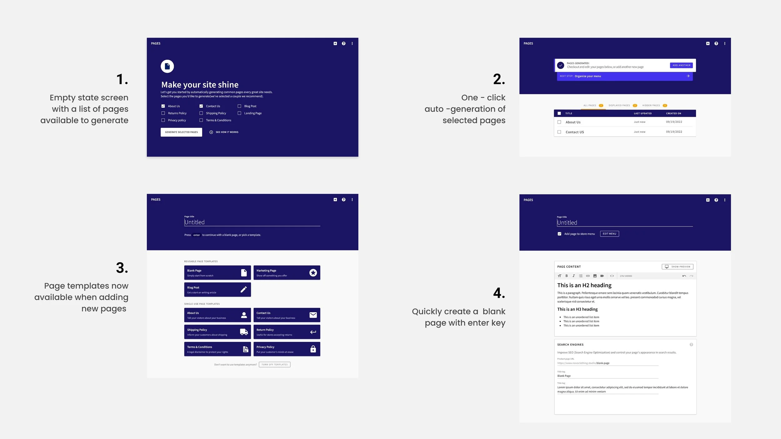
I coded each template in HTML and we set out to develop and test the Page Generator before committing it to the Creator Guide. When it was ready, we created an A/B test to measure engagement (# of pages per store) and trial-to-store conversion rates.
When the results came in, we weren't surprised to see how drastically the Page Generator improved engagement. However, we we're very pleasantly surprised to see that trial-to-store conversion rates were improving, too! Even though it was just a small feature, it was proven to influence some users enough to get them to convert.
Give it the visual treatment
With the Page Generator now in our toolbox, we finalized our Creator Guide steps:
Fill out welcome survey (already completed)
Add a product → Products empty state/landing page → Type product name & price → Save
Edit storefront design → Click "logo" → Drop in logo → Save
Add content page → Pages empty state/landing page → Click "Generate Pages"
Purchase a plan (we added this as an "unlockable" last step)
Now with all the pieces in place, we were clear on how we planned to pull it all together in hi-fi.
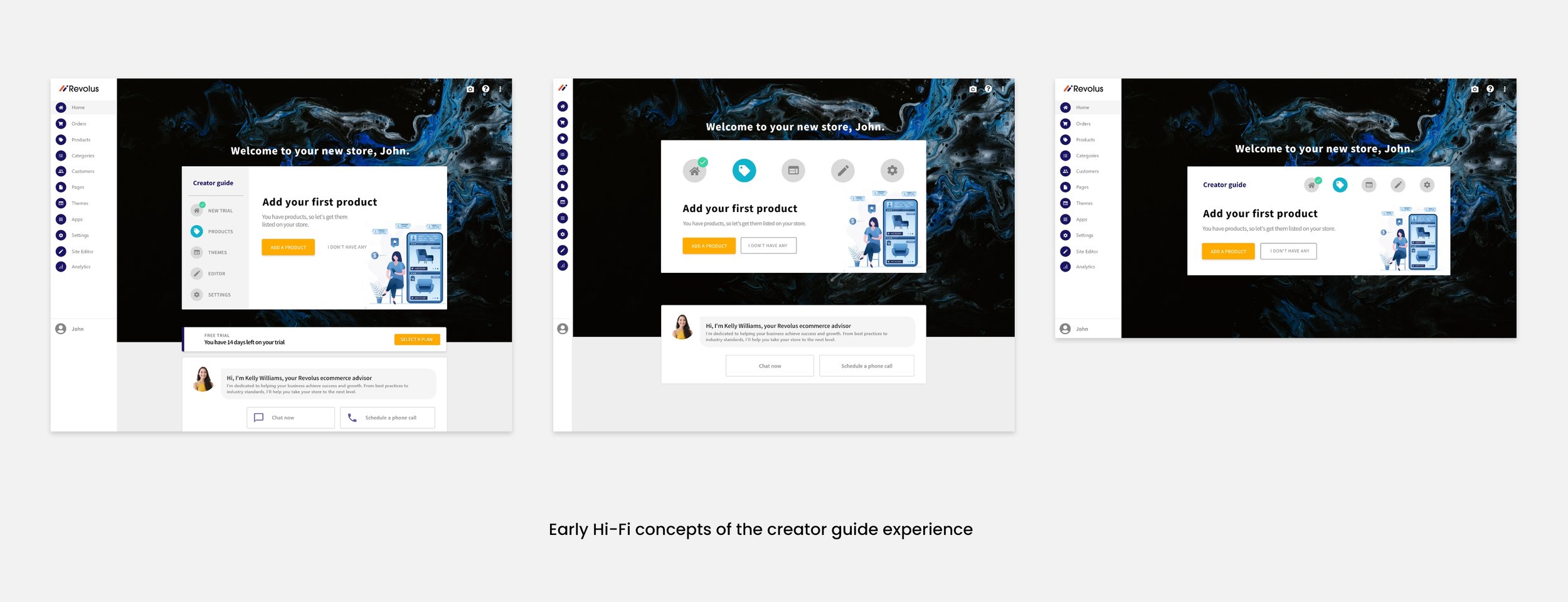
Bring it to life
The developer on our team worked remotely, which meant it was imperative we stay in constant contact through all phases of implementation. We had daily design reviews to ensure faithful representation of the designs. I helped by splitting the UI into individual components and their states.
I was also able to help with the styling and animations and contributed via some helpful animated prototypes with transition timing functions and a CSS solution to position the guide correctly on the dashboard no matter the viewport size.
Measure success and next steps
The development and QA went smoothly and we were able to release the creator guide as an A/B test measuring trial-to-store conversion rate. The Creator Guide did show an increase in conversion rates which signaled success for the project.
The Creator Guide at the end of this phase was poised to be a solid foundation for future trial experience improvements, as well as a reusable pattern for post-purchase creator success.
That was indeed the plan for the next phase: Reuse and improve the Creator Guide to be an always-there-for-you assistant for when you're stuck on what to work on next to grow your business.
Closing thoughts
Because time was of the essence on this project, the decision was made to limit the user research. Ideally, I would have preferred to interview prospective users and understand their thought processes and emotions when making the decision to try out an ecommerce platform like Revolus. Those qualitative insights would have been helpful to validate the vision early on.
That being said, I am very proud of the work we accomplished for this project. I feel the visual design of the creator guide and empty states does faithful job representing the style and tone of the product and brand. I am also proud of how we were able to effectively distill the creator Guide experience to 5 (really 3) steps, each completable in less than 3 clicks. Additionally, the Page Generator idea proved to be a novel way to make an otherwise tedious and intimidating task (writing content pages) fast and fun.
That was indeed the plan for the next phase: Reuse and improve the Creator Guide to be an always-there-for-you assistant for when you're stuck on what to work on next to grow your business.