Streamlining high-volume loan journeys for a million-user digital bank
MoneyMate is a credit-led digital bank building for emerging markets, with a strong presence in USA, and over 1 million registered users. It aims to empower users with convenient and secure financial solutions, especially for those with limited access to traditional banking services.
-
Project Type
Client Work
-
Role
UI/UX designer
-
Year
2021 - 2022
-
Team
1 ux designer, 1 Product Manager, 4 engineers.
My Role
I was responsible for all design efforts made on the lending funnel, the product’s core offering.
The Goal
The product was already being used. And the business was already doing amazing numbers. The goal now was to revamp the lending funnel to be more streamlined, transparent, and in line with the brand refresh being done.
As we were also trying to introduce our customer base to our banking services, the secondary goal was to identify opportunities within the lending flow to nudge users towards using banking features.
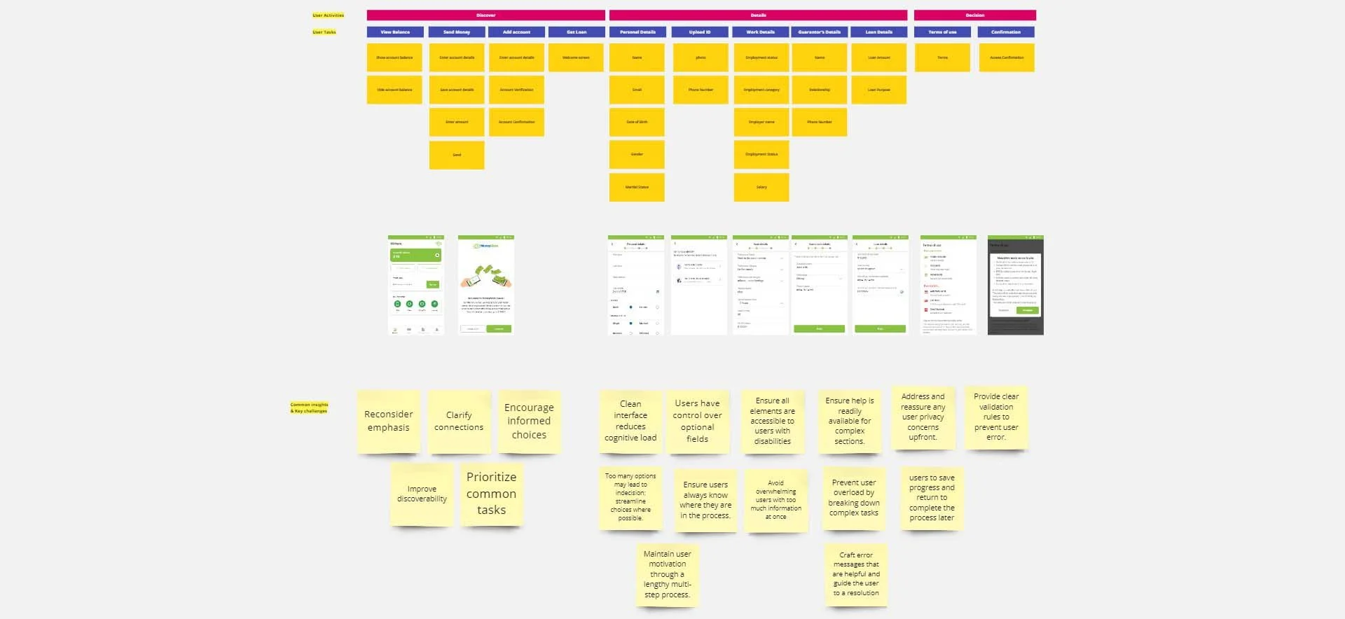
Auditing the Lending funnel
We needed to audit the entire lending funnel before we could overhaul. The first step was to put all the various screens and states into a single user flow so everyone on the team could see what the customer’s journey currently looked like from end to end.
The goals of the revamp were clear:
Redesign areas in the lending funnel that were contributing to user churn to be more streamlined.
Simplify the way we were displaying loan offers and think of new ways to recommend higher ticket loans to users.
Identify opportunities to nudge users towards our new banking features.
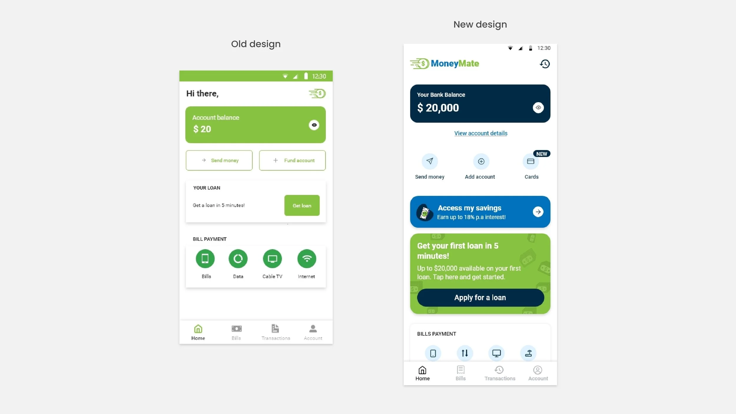
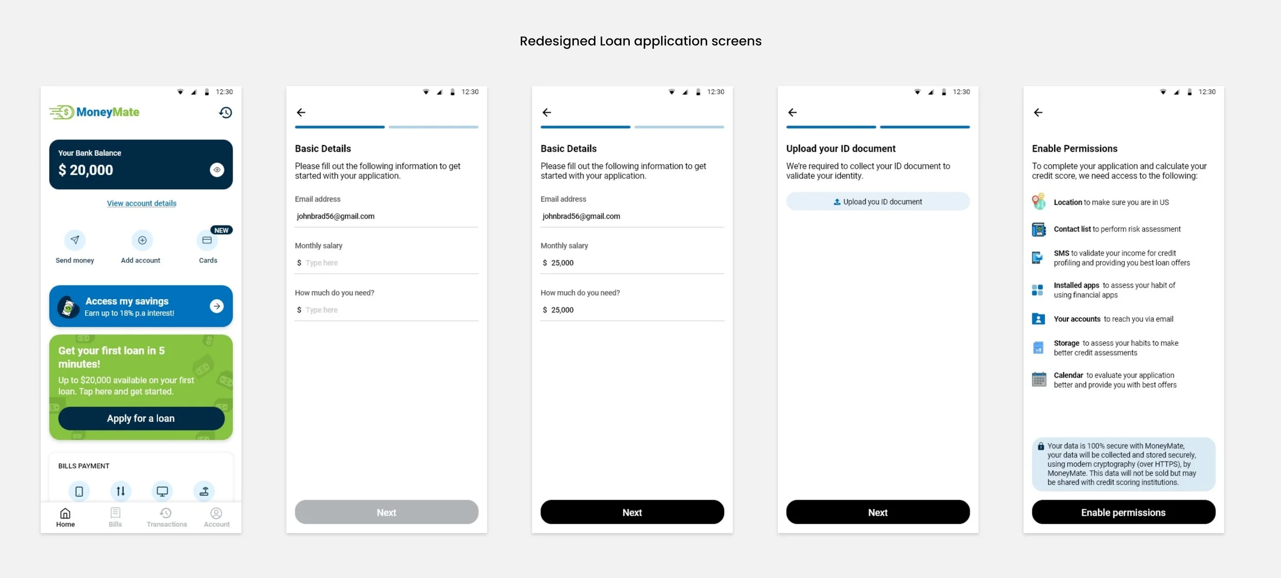
Loan Application
The loan application process was unnecessarily bloated. After discussing with members of the Risk team to understand exactly what data points were necessary to successfully score a prospective lender, it was clear a lot of fields could be shaved off the application flow
What I did ?
I worked on a revised loan application flow that I ran by the Design Lead and the PM in charge of Loan application.
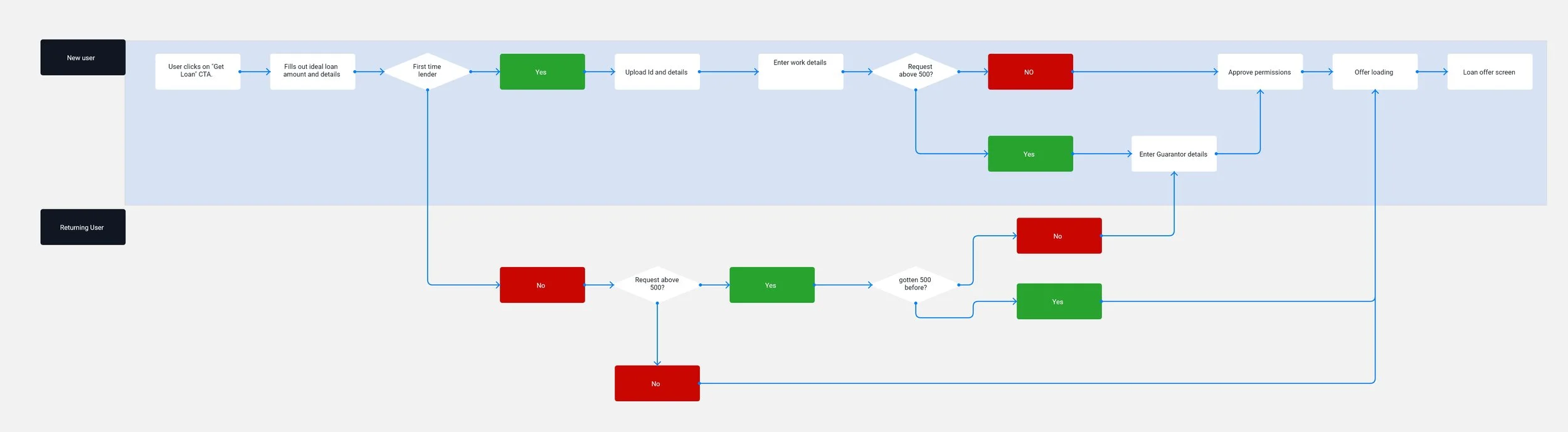
Revised loan application
Relevant personal information of users would be pulled from their ID documents and other information would only be required depending on the amount of money being requested for and the nature of the applicant's work.
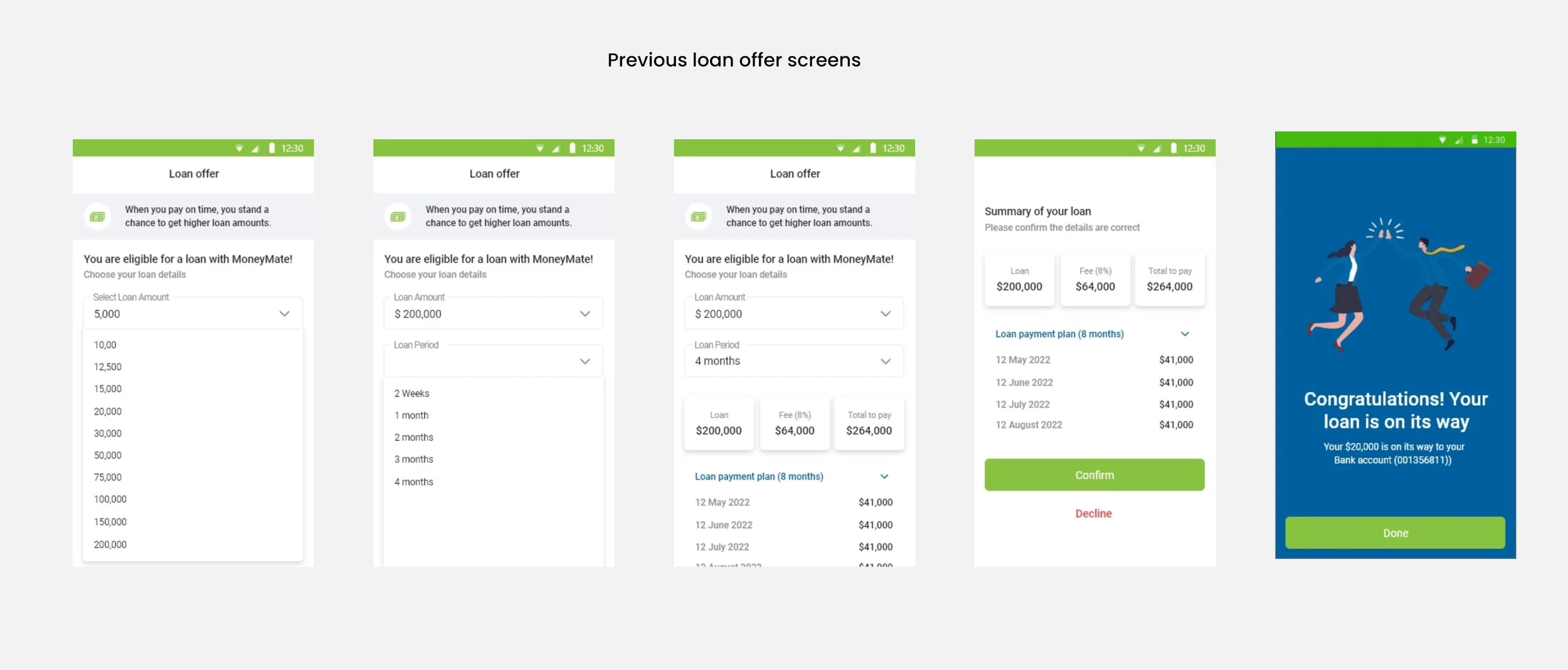
Loan Offer
App analytics was showing that 8% of the total first time lenders were dropping off at the loan offer screen, so this was one of the big priorities of the redesign.
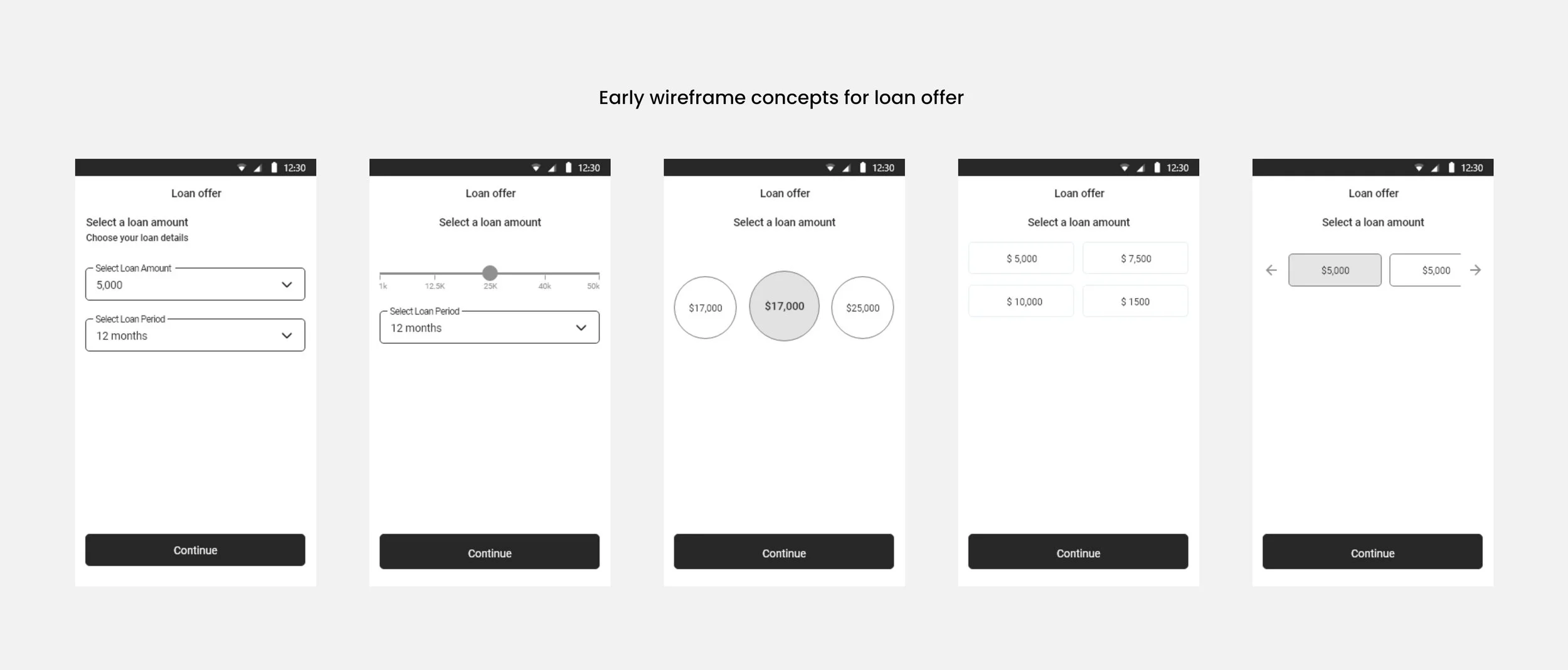
Next step
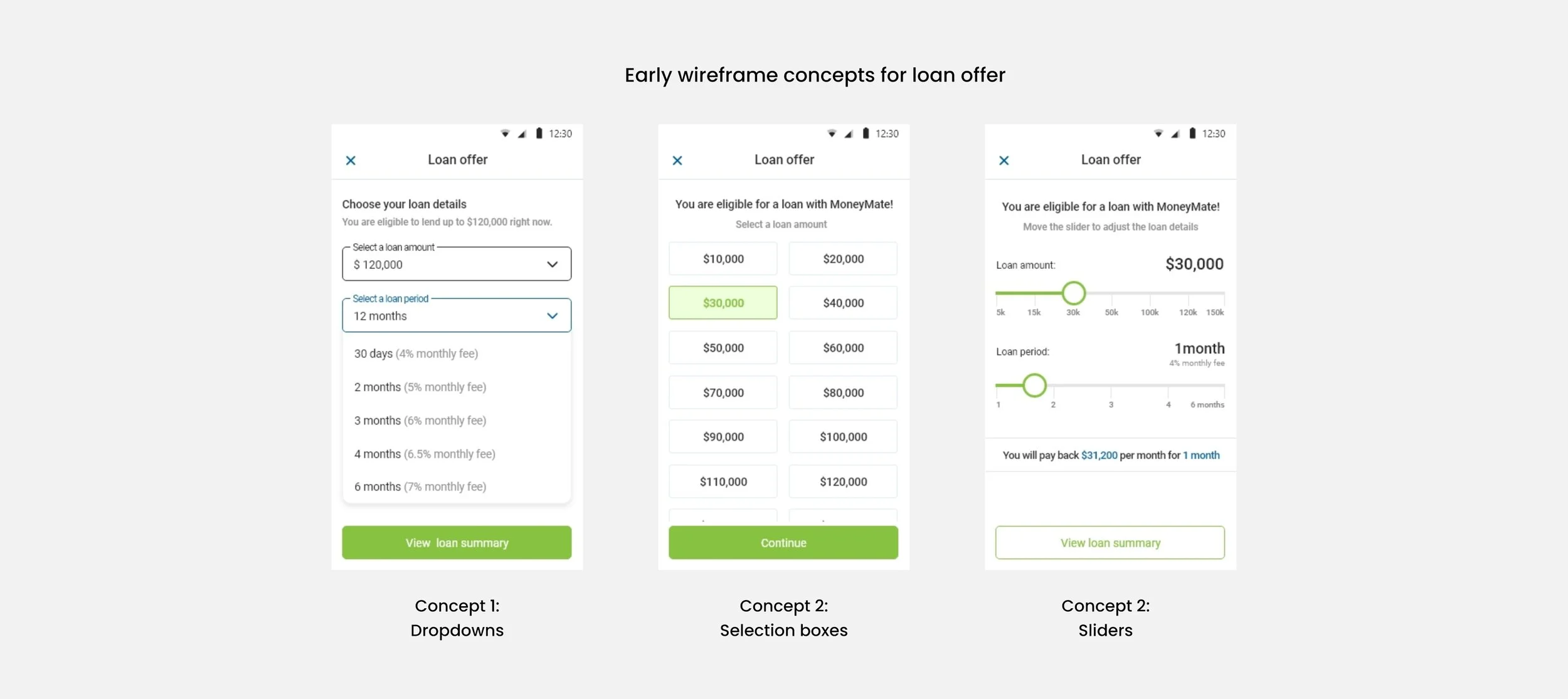
After reviewing similar products like Monzo, Revolut and Opay, the next step was blocking out wireframes. 6 concepts were developed, I then worked with the design lead to scale them down to based on perceived usability & scalability.
Testing
3 concepts were moved to usability testing. I collaborated with an internal UX researcher team to plan and run 8 moderated test sessions, and then ran unmoderated tests via Useberry.
The purpose of the test was to:
To understand how users would interact with the various UI components.
To determine if the decline button was churning prospective lenders and if we could improve conversion by redesigning it.
To determine how best to lay out loan offers & terms.
Major insights from the usability tests were:
Participants testing the dropdown variant recorded the highest rate of completion, followed by selection boxes, and finally, sliders.
90% of participants shown a vertical layout were able to adequately explain their loan terms, as opposed to only 58% of people shown the current horizontal layout.
Participants were more likely to remember their max amount when it was a permanent component of the offer screen.
Over 60% of participants were declining offers in a bid to adjust their loan terms.
The redesign
In the redesign, I substituted the horizontal layout for a vertical one to keep the loan terms simple. Adding percentages next to the months and showing a payment breakdown once a tenor is selected also helps further simplify our offer terms.
To nudge users towards higher loans, I made the max amount a permanent thing on the loan page and started showing loan offers from highest to lowest.
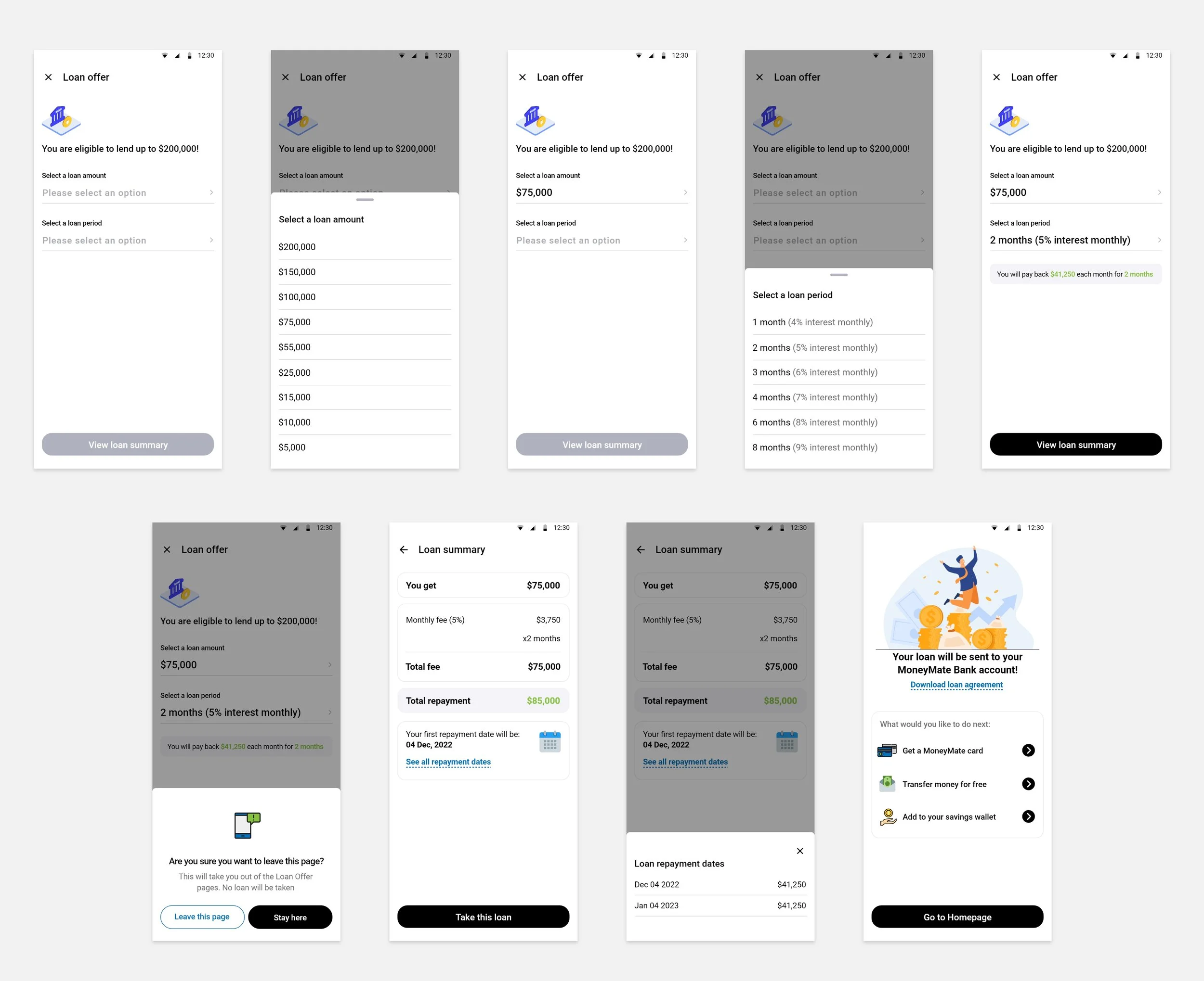
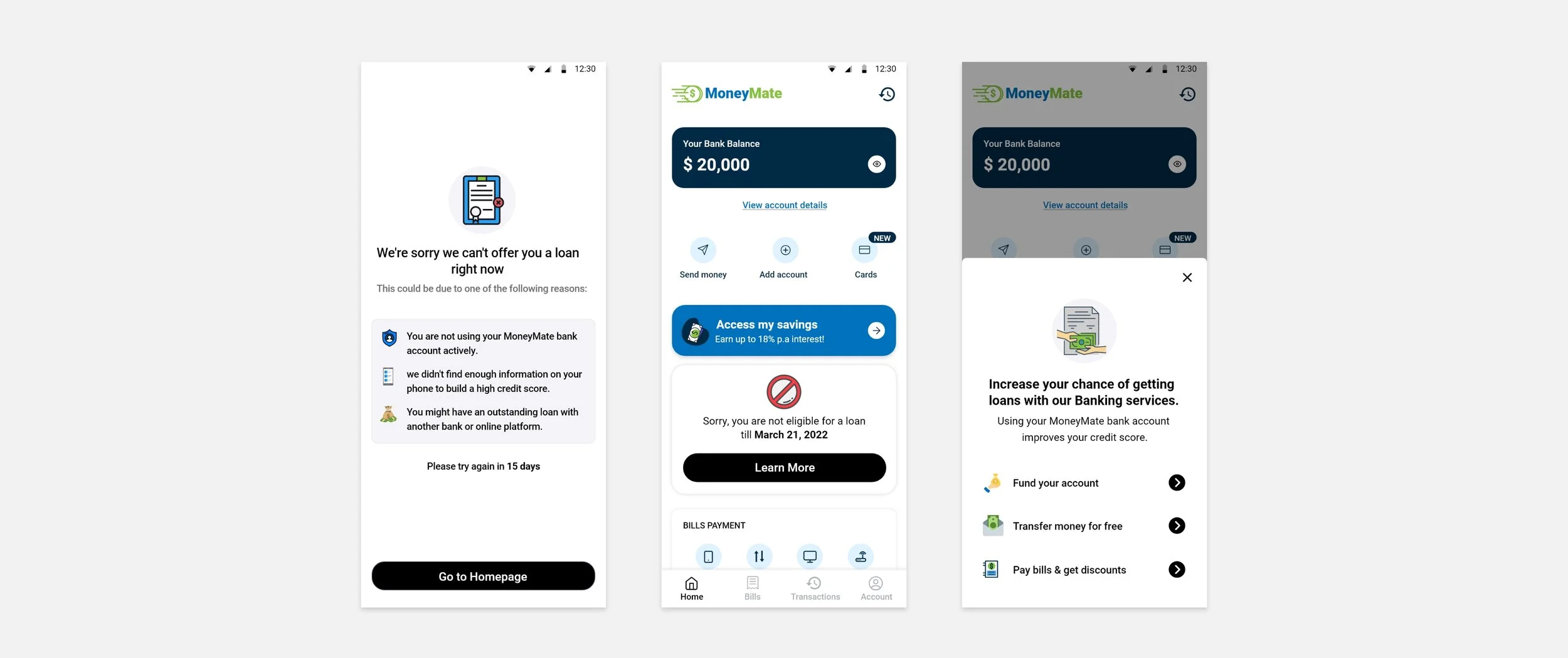
In the redesign, banking nudges were added to the end of the funnels, both for when the loan is approved and when loans are declined.
For users whose loan requests were declined, using MoenyMate banking services would help increase their credit score.
Result & Learnings
4%
Churn rate on the loan offer screen dropped from 8% to 4% in the month of its release.
100+
Average amount of MoneyMate loans being disbursed each day in US.
The revamped loan funnel started being released to production in January 2022. Since then, Moneymate has become a house-hold name among online banks within the country. Some major takeaways from this project were:
Working with a global remote team: Over 9 months I worked within the Lending US team. The importance of clear communication, cultural awareness, adaptability was deeply re-emphasised.
Designing with data: With a user base of over 1 million users and 100+ loan being disbursed each day, we couldn’t leave anything to chance. Every change to the app could have very important impact, and so every idea was rigorously tested with large sample sizes. Monitoring product analytics to identify improvement opportunities was also a daily part of my work.